


The Weekly Spill #35
we are so back!! (if you ignore the bad stuff)


Happy Monday! Waking up to a world where Beyoncé is an Album of the Year winner this morning just felt correct. Sure, a lot of crazy shit is happening… but there is a new Lady Gaga single, and I got my pre-sale email for the Cowboy Carter tour. So, maybe it will all be okay. In the meantime, here are some of the non-scary things that have taken over my brain this week:
The Grammys: Did they manage to fix the Grammys? Last night’s ceremony was perhaps the most enjoyable in recent memory. I was starting to feel the length towards the end, but that could be my own personal attention span issue. As with every award show, I wish they would hand out a couple more awards during the main telecast. Less talky, more awardy. Anyway… here are my top takeaways from last night:
Thrilled that Beyoncé finally won Album of the Year. One more injustice remedied! I stood up in anticipation for the announcement the same way that men do when they watch sports? Cowboy Carter is such a special album, and seeing the Grammys choose correctly is a nice change.
Doechii’s performance completely blew me away. I would love to rewatch it and link it here, but unfortunately it is not available on Youtube. Someone pls fix that. Also, fantastic PR work by Thom Browne. Congrats!
Lady Gaga has the 1960s Cher bangs:

she’s so me Do y'all remember how I said in my last post that big tap numbers are in for 2025? Yes, exactly. Oh, this? That is my finger and it’s right on the pulse. Sabrina Carpenter, are you secretly a Spilling the Beans reader?
How many outfit changes are required for award shows now? And what are the logistics of that? I’d love to know.
Lady Gaga’s Mayhem era: You have no idea how difficult it is to type a newsletter whilst keeping my paws this high up, but I’ll manage for you. I was excited about Mayhem before she dropped “Abracadabra,” but now it’s serious. Now I’m calling family members to let them know just how back we are.
Who else is dropping a full music video during a commercial break?
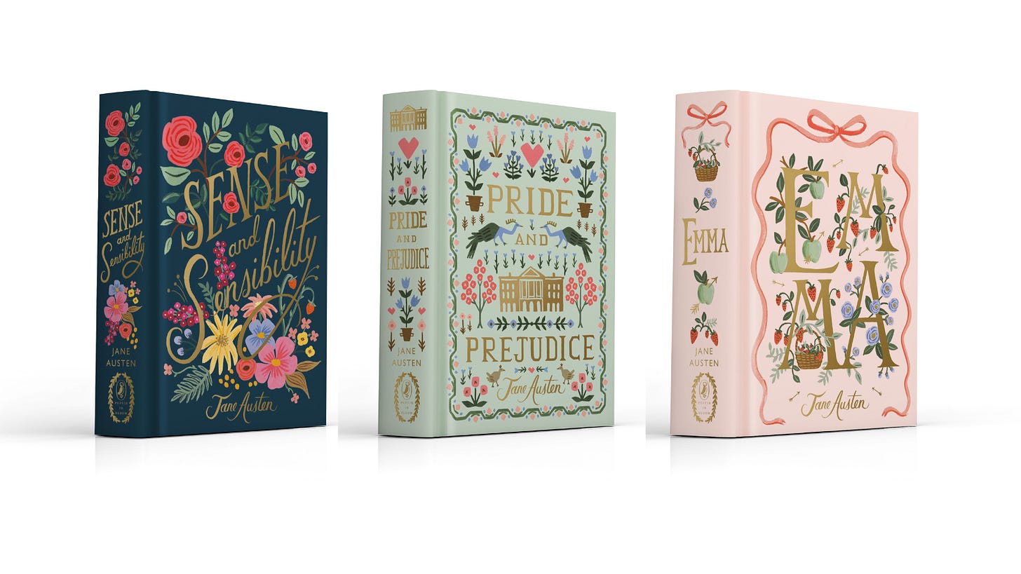
The ugly Jane Austen covers: I posted on notes1 about the new Puffin First Impressions collection that Penguin is releasing, but I feel like I’m going crazy and I have more to say.

First, here is the blurb about the collection from the Penguin UK site:
Fall head over heels for First Impressions, Puffin’s boldly designed new YA Jane Austen collection. Like all the best romcoms, Austen’s novels are full of meet-cutes, missed connections and drama; they are masterclasses in the lost arts of stolen glances and breath-taking gestures.
With a stunning modern design and forewords from leading YA romance authors, this eye-catching six-book series is an open invitation to escape the brutal nonchalance of modern dating and embrace your inner romantic.I understand that I am not the target demographic for these. There are many different editions of Jane Austen’s work to choose from, and given that her 250th birthday celebration is in December, I imagine more will be released this year. That being said—I do not like these covers. I think they are ugly. I don’t like this style of romance book cover with the illustrations of the characters, and the colors are so jarring. I see what they were going for, but the end result is just not it.
As a former teen girl who read both YA romance and Jane Austen, I don’t understand these from a marketing perspective either. This style has become synonymous with “spicy” books like the bestsellers written by the authors chosen to write forewords for this collection. If that is what you are looking for in a romance (nothing wrong with that btw), you are going to be disappointed. I think if I saw these randomly in a bookstore, I would have assumed they were modern re-tellings. So, they don’t reflect the books well and they are ugly.
The recent editions that Puffin did with Rifle Paper Company are pretty, and teenage me would have been obsessed with them. A better decision (in my opinion) would have been to commission the other 3 novels to complete this set rather than create this new First Impressions Collection.
Let me be clear: My bitchy note about these covers has absolutely nothing to do with the way the characters have been portrayed. If you are angry because these illustrated characters aren’t exclusively white—we are not on the same page, and I will continue to block you. Jane Austen famously offered almost no physical descriptions of her characters, so there isn’t even textual support to excuse your blatant racism. For example: In Pride and Prejudice, all we are told is that Elizabeth is the second prettiest of the Bennet sisters, and Mr. Darcy is described as handsome and tall. That lack of detail is part of what makes Austen’s characters so eternally relatable. Standards of beauty may change, but ranking the beauty of siblings is forever.
Super Bowl Ads targeting me specifically: I would love to know why I am being personally targeted by the Super Bowl ads this year. First, UberEats released the Cher ad.
And then the When Harry Met Sally reunion at Katz’s Deli to hawk mayo??
It’s getting weird… I’m worried that there is a photo of me at some ad agency. What is happening? Could it be that I am the ideal customer?
Note: Does anyone know why Sydney Sweeney is in the mayonnaise ad? Is there something I’m missing? Please let me know.
Playboy’s return to print: I’m both intrigued and cautiously excited about this. Every cool person I know owns at least one vintage issue of Playboy, so I’m a believer that a relaunch can work. Maybe this is too optimistic, but with the right vision I think the magazine could make a big comeback
and potentially stop the radicalization of men and save democracy?It’s going to be difficult to accomplish with only one issue per year, but you know…baby steps. I’m curious to see who they will get to contribute. As cliche as the old adage is, you really can read vintage Playboy for the articles. One of the issues on my coffee table features short essays on creativity by Truman Capote, Henry Miller, Allen Ginsberg, John Updike, and Arthur Miller. Another has a piece on race by James Baldwin. That kind of cultural cachet combined with the centerfolds is what made Playboy such a singular phenomenon. Also, this just happened:
So, who knows? Lori Harvey will grace the cover of the new issue which hits newsstands on Feb. 10th. Go grab a copy before Alito buys them all.
This shot-by-shot analysis of Mimi Imfurst vs. Everyone: The world is on fire, and this made me laugh. Highly recommend.
That’s all the beans for this week! While writing this I spent over an hour looking at different editions of classic books, so maybe I’ll rank those in an upcoming newsletter to make that feel less like time wasted? Let me know if that sounds interesting. Thank you for reading—have a fabulous week diva!


Update: I’ve deleted the original note because it was being shared by so many white supremacists and was being used to amplify their disgusting beliefs. At some point my post—a snarky quip about a trendy style of book covers that I don’t find aesthetically appealing—started to be amplified and celebrated on a side of this platform I didn’t even know existed. Ultimately, the fact that I was inadvertently providing an easy piece of ammunition to hateful people matters much more than a pithy comment I made about these book covers.
I’m choosing to keep my thoughts in this newsletter because what I’ve written here is not being used to spread hate. I’m thankful to have built a community of subscribers who will read my musings on relatively dumb things (like book covers), and not make it weird.
as1 being lowkey a mess is completely redeemed by mimi vs everyone. there are like six iconic quotes in a two and a half minute span. truly incredible television.